
Fashion Color Theory
HERE ARE A FEW TERMINOLOGIES YOU SHOULD KNOW TO UNDERSTAND COLOR IN FASHION:
Complementary Colors in Clothing and Fashion
COMPLEMENTARY COLORS = Colors that are exactly opposite each other on the color wheel.
Complementary colors are those that are exactly opposite on the color wheel. This is best explained in detail by use of the color wheel itself.

Two classic complementary colors: blue and orange. Note how they are opposite each other on the color wheel.
When putting together two fully saturated complementary hues side by side you get a combination that has maximum color contrast. This means that the hues are as different from each other as they can possibly be.
Adding white, black, gray to any of the two colors does not change their complementing nature. It only changes their shade, tint, or tone. By darkening one hue and lightening the other you enhance their contrast of lightness.
For example, by darkening the hue blue-green (cyan) and brightening its complementary hue red-orange and combining them together in a color scheme for an outfit, you get the following result:

Dark cyan and bright red-orange make for a strong complementing color contrast.
The blue-green in this outfit is clearly the canvas color. By using its complementary color as an accent color you achieve maximum “pop”. This is because the color contrast is is as high as it gets.
Also, the luminance of both colors is different (not much, but still). This means that there is also some contrast in lightness to make the accents stick out even more.
How to Wear Complementing Colors
It’s not easy to wear strong complementary colors and not look weird. This is truly quite a feat to pull off, but if you know how, you’re definitely going to be noticed.
Alright, as we already stated in other articles, it’s sometimes a good idea to wear canvas colors that are not too explosive. What we mean is, it’s often best to use darker colors in your outfits color scheme. For example, dark blue, olive, burgundy, brown, and so on.
It’s then best to add a tad of any bright color to accent the canvas. This is where the complementary color can come in.
If you pick dark blue (navy blue) as your canvas, it would be interesting to choose bright orange as the accent, don’t you think?

Did you notice the orange highlights of the socks? Of course you did! How could you?
That’s exactly what happens when you wear bright complementing accents in your outfit – they catch people’s eye! It’s a guarantee for comments from your friends as soon as they notice those pair of socks. And, since the colors are well-matched, the comments are going to be good ones!
However, you always have to be careful not to overdo the high contrast. Stick to small complementing elements in your outfit and maybe even try to mix it up a bit with analogous colors. Don’t know what analogous colors are? Read our article.
Analogous Colors in Fashion
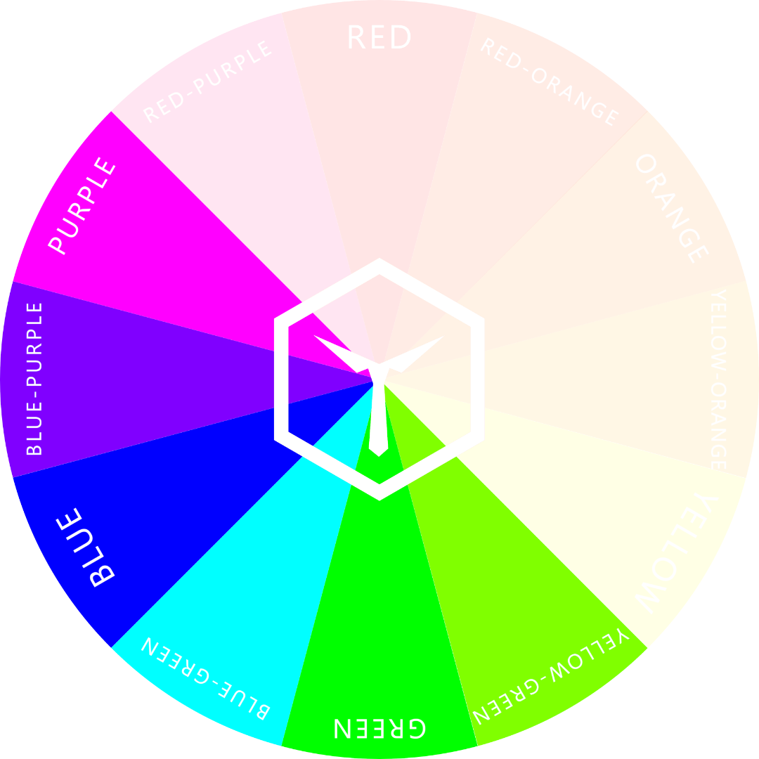
ANALOGOUS COLORS = Colors next to any given color (or hue) on the color wheel.
Analogous colors are those that are adjacent to any given color on the color wheel. For example, the analogous colors or purple are red-purple and blue-purple.

The analogous colors of purple are: red-purple and blue-purple (to the left and right).
This scheme can be used for any of the twelve hues on the RYB Color Wheel of Fashion and can be a very handy and powerful tool to make any outfit look well-composed and stylish.
Take a look at the following example where our model wears the hues blue-purple (suit), purple (shirt and bow tie), and red-purple (suspenders). All of these hues are from the analogous scheme of purple and go well with each other.
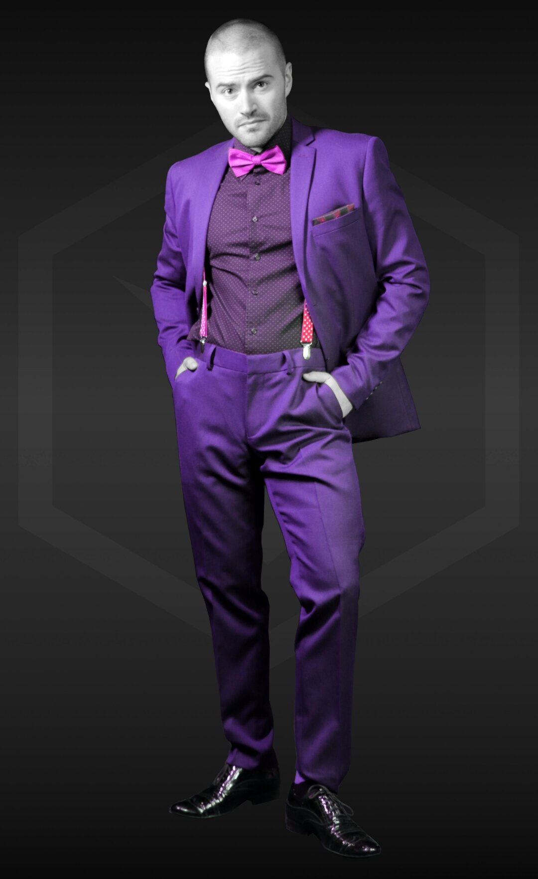
This is a very unusual color scheme for a formal suit, but it is nonetheless analogous and well-composed.
Although the example is a rather weird one and, quite frankly, nobody would ever wear such a suit, it is a good example exactly because the outfit still looks visually pleasing despite the odd color scheme for a formal suit.
The example proves the power of wearing analogous colors.
Variations of analogous colors
Please note that all variations of the analogous hues are acceptable when designing the color scheme. You can wear dark, light, pale, or bright versions of any of the three hues.
In most cases, it’s actually beneficial if you do mix the shades in your outfit.
Since the color contrast is low (because the colors are analogous), you will have to bring in contrast through the use of shades and tints. Pure black and white are also always very viable options, and so are the grays.
Color harmony
Analogous color schemes are mostly very pleasing to the eye because of color harmony. If you wear an outfit using predominately an analogous scheme and you choose to sprinkle in a complementary color as an accent, your whole getup will be harmoniously complete.
The color harmony of an outfit is what makes a style complete and visually pleasing. Going with an analogous color scheme for outfits is a very easy way to achieve color harmony.
Use our color wheel of fashion to help yourself put together the most harmonious of outfits every single day. And don’t forget to read up on our many articles on color in clothing to learn all there is to know about the topic.
Warm Colors in Clothing
WARM COLORS = Colors towards the red and orange side of the color wheel.
How about putting a smile on someone’s face? Or catching the eye of virtually anyone when you walk into the room? I’m sure this sounds pretty awesome to you. The best part about it, is it can be easy to achieve.
You may be wondering how you can do it. Well, I’ve got two words for you: warm colors.
Maybe you’re aiming for a conspicuous look or you want to go bold with your fashion style. Either way, warm colors should be in your go-to fashion arsenal.
But, first of all, you need to know what warm colors are.
What are Warm Colors?
To pick out the warm colors, the color wheel is split in half. As seen in the image below, warm colors are:
Yellow
Yellow-orange
Orange
Red-orange
Red
Red-purple

Warm colors all have red, orange or yellow hue.
Basically, yellow, orange, and red hues make up warm colors. On the opposite side of the color wheel, we have cold colors. These are more subdued hues and are less “in your face” than warm colors.
Psychologically, warm colors arouse attention, passion, excitement, and fun. There’s no doubt that they burst with energy, especially in their pure, fully saturated hues.
How to Use Warm Colors for Clothing
Let’s look at some of the ways we could use warm colors in clothing.
As a canvas color:
Though this is rarely done, it can be easy to pull off. As a canvas color for your outfit, you’d want to go with a shade or light tint of the hue. That way, it won’t come off as too shouty but will still be attention-grabbing.
For example, try wearing dark red or very light yellow. Beige or sand count as warm colors as well. They are excellent choices as canvas colors.
As an accent color
Using warm colors as accents is quite a safer approach for most men out there. An example would be a red-checked flannel jacket to accompany a gray or another neutral canvas color. This gives the outfit an overall “pop”. Stick to our 10 Golden Rules of Color in Fashion if you want to get the most out of such an outfit.
To inspire intimacy or create intensity
Did you know roses, especially red ones, are the most bought flowers on Valentine’s Day? Of course, you did!
One of the best times to put on an outfit with warm colors is when you’re going on a date. Red is usually the color that comes to mind first, but yellow also has a similar effect. According to a study published in the journal of Color Research and Application, red and yellow colors significantly increased the heart rates of participants. So, if you’d like your date to fancy you even more, you know what colors to work with.
Check out our guide on the meanings and interpretations of different colors for more information.
Spring and Summer:
To a large extent, seasons dictate the colors used in fashion. For warm colors, it’s usually spring and summer.
Spring is when flowers begin to bloom and color returns to the lands. Summertime is for the holidays and sunshine. Who doesn’t want to look bright and fresh in these seasons?
You can always pull off darker warm colors in Autumn. They go very well with the colors of the fallen leaves of trees and the elongated periods of dawn and dusk.
During winter it’s all a bit different. It’s not that warm colors in your outfit won’t look amazing then. It’s just that the obvious reason for why warm hues are not ideal then, is because they just don’t blend.
You can’t really go wrong with warm colors in your fashion arsenal. They are always exciting to work with and can help switch up your wardrobe – especially as accents. Whenever you see an opportunity to use them, go for it. If you’re unsure how to use warm hues to their full extent, read up on our articles. More information >
Cold Colors in Clothing
COLD COLORS = Colors towards the blue side of the color wheel.
As someone who wants to command a level of influence among peers, you know you can’t do without your clothing style. This is one of the aspects that define you to others and set the tone on how people interact with you.
One of the most important factors when it comes to clothing and making an impression, ist color. We can divide colors into two segments: warm and cold colors. In this short article, we’ll be discussing cold ones.
You may be wondering what cold colors are. As you will see in this article, they are fairly basic and easy to identify. You probably have many clothes in these colors. Without further ado, let’s get to know what cold colors are.
Cold colors are of hues between yellow-green and purple.
What Are Cold Colors?
Cold colors (or rather cold hues) are those that have an undertone of either: green, blue, or purple. Using the color wheel as a reference, these hues are:
Yellow-green
Green
Blue-green
Blue
Blue-purple
Purple
Cold hues usually don’t exhibit much energy which is why they are perceived as calm. They are not overpowering and tend to blend in with their surroundings well. They are also generally seen as reserved or melancholy.
Blue, the coldest hue, for instance, immediately reminds us of the ocean and the sky. There is a certain reassurance the color blue inspires. At the same time, blue can also be perceived as a dull color. Nevertheless, it is considered an elegant color in darker tones.
The color green bursts with life, freshness, reliability, and balance. It’s a reminder of nature and can be used to sturdy and “ground” your fashion outfit.
Purple, or sometimes violet or magenta, on the other hand, sends the notion of purity, idealism, and luxury. It’s not a very common color used in fashion because of its mysterious nature. But it can create an intentional impact when used correctly.
Another thing to note is that shades or tints of cold colors create different meanings from their pure hues. For example, the way people perceive light green is different from when they see dark green. These differences in meaning determine how each color is used in fashion. More on dark and light colors in clothing in our full-length article.
How To Use Cold Colors in Fashion
Cold Colors as Canvas Colors: Apart from neutral tones, cold colors are great as canvas colors in any outfit. Because of their somewhat subdued nature, they create the balance needed to make any outfit complete. Cold colors are pretty much ‘safe’ to work with compared to their opposite warm colors.
Working with seasonality: Cold colors can work well in all seasons, depending on their value (lightness). But they are better suited during fall and winter, especially if they are of a lower value (darker). Not only do they blend with seasonal colors, they also help keep you warm by absorbing heat from light.
Cold colors can explain your overall (most probably calm) personality or emotional state to people around you. They are easy to incorporate into your wardrobe and you’re sure to hit a home run with them.
Whether you want to come off as dependable or easy-going, cold colors are a great line-up for your fashion style. Most cold colors are also ideal for more serious professional settings.
Contrast in Clothing
CONTRAST = Difference between two (or more) colors.
Contrast describes the perceived difference between two (or more) things. If the difference is high, so is the contrast. The opposite is also the case.
There are two kinds of contrast that are relevant to color theory for fashion: Contrast of lightness and contrast of hue. The contrast of lightness/brightness is different from color-contrast.
The former changes according to the value and luminance, whereas the contrast of hues changes according to the position on the color wheel. Here’s a “quick-and-dirty” example to explain further:
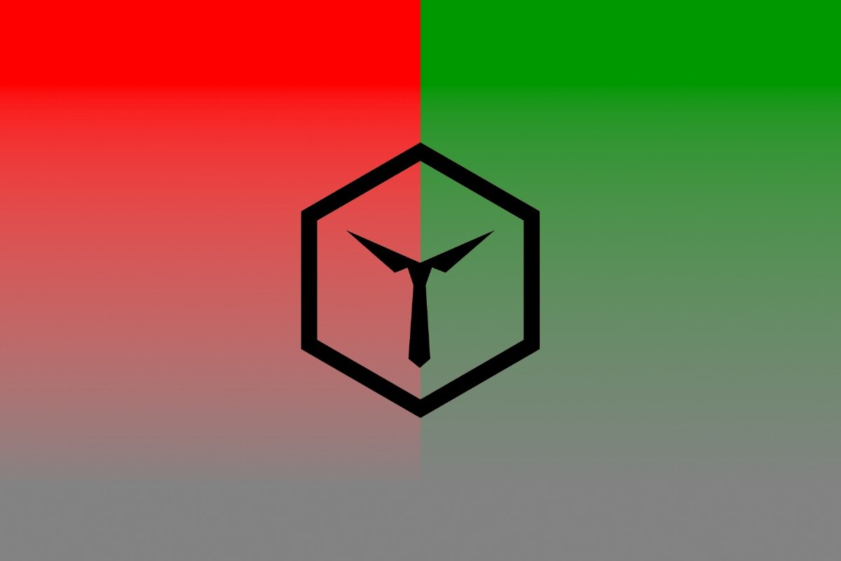
Image #1: High contrast of hue but no contrast of brightness

Image #2: High contrast of brightness but no contrast of hue.
Image #1 shows two hues (red and green) with their fully unsaturated versions in the bottom half of the image. Note that the gray tone of both colors is the same. This is because both colors (pure red and shaded green) have the same luminance.
The color-contrast between red and green is large because both hues are far apart on the color wheel. On the other hand, the contrast of brightness is zero. This is because the luminance is identical.
Image #2 shows the same red as in image #1 accompanied by its lighter cousin “pink”. Both colors are shown with their respective unsaturated versions.
It becomes quite apparent that both colors have high contrast of brightness because pink has added white in it, making it much lighter.
Interestingly though, the contrast of hue is zero because both colors have the same hue (pure red). Pink is simply red with added white to increase its value.
Contrast for Fashion:
In fashion, we use contrast to spice up outfits and to make them interesting. It’s important to understand that there is not just contrast of brightness, but also between two different colors.
The color-contrast is the largest when both hues are the farthest possible distance apart on the color wheel. This would make them completely complementary to each other.
The contrast of brightness is the largest between pure white and pure black because they have the largest possible difference in luminance.
High contrast is much more eye-catching than low contrast clothing. Many outfits benefit from a tad of contrast to make them a bit more pleasing to the eye since outfits with very low contrast can seem awkward.
We will be going into more detail on contrast and how to use it in another future article, but for the moment read up on the 10 Golden Rules for Color in Fashion. Rule #2 explains a good deal about natural contrast and how to use that concept to your benefit.
Luminance in Clothing
LUMINANCE = Indicates the brightness of a color.
Luminance is an indicator of how light and bright a color is. It is the amount of light that gets reflected by any colored surface.
It is important to understand that every color has a different amount of luminance at full saturation. This is due to the fact that different hues have varying wavelengths. Also, the luminance of a solid color, such as that in cloth, is at most as bright as the light that is shone upon it.
It is easiest to see the luminance of color when you desaturate it. The following example illustrates this quite well:

Both colors (cyan and red) seem to have a similar amount of luminance at first but as soon as you show them unsaturated, red appears much less light. Note that both colors are at their full intensity (saturation).
Luminance is not just affected by the hue of any given color, but also by the value. This is where most people start mixing up definitions…
The value of a color is the amount of white or black mixed into a hue, generating a tint or shade of said hue. Adding white (tinting) increases the luminance AND value of the color. Adding black (shading) decreases the luminance AND value of it.
This happens because pure white is the “color” with the highest luminance, whereas black is the one with the lowest luminance.
Why is luminance not the same as value, then? Well, here comes the fun part:

Although these two parameters are closely tied together, color value and luminance are not the same. The illustration above shows this.
It shows two very different colors. On the left-hand side, we have dark yellow, and on the right-hand side light blue. The former is tinted, the latter is shaded.
Now, this is where it gets interesting: Both colors have the same luminance even though one has added black and the other added white! In other words, their luminance is identical but their values are completely different.
What does this have to do with fashion?
There are two major things we have to consider for luminance in fashion:
The lighter and brighter the color, the more it “pops” and is eye-catching
Luminance is influenced by the amount of reflected light off of a surface. This means that the texture and material of clothing also affect perceived lightness/brightness.
Wool, for example, doesn’t reflect color as well as cotton, which makes it’s color “pop” less. On the other hand, sequins on a dress reflect light very well, which is why fashion designers put them on dresses in the first place.
Use your new insights on luminance for fashion to your benefit. Read our article on dark and light colors in clothing to learn more about the topic.
The Color Wheel of Fashion
COLOR WHEEL = Made up of 3 primary, 3 secondary, and 6 tertiary colors.
There are many different color wheels around and none of them are perfect. Why? Because perfection (especially for color wheels) isn’t even possible.
First, here’s what you have to understand concerning color wheels:
There are three types (subtractive “RYB”, and additive “RGB” and “CMYK”).
It doesn’t matter, in which “direction” the color wheel goes (clockwise or counter)
There is an infinite amount of color possibilities for any given color wheel
Huh? Ok, Let us show you what we mean.
This is our RYB Color Wheel. It’s best used for categorizing clothing.
In Fashion, we use a subtractive RYB color wheel. This means, that our primary colors are red, blue and either green or yellow. For fashion, we tend to use the RYB (not RGB) color wheel, which uses yellow as the third primary color.
The “RYB-Wheel” is the one you learn in arts and crafts when you’re young. The other two are used for other purposes:
RGB is used for lighting and digital formats (i.e. screens)
CMYK is used for printing
Since we’re writing about clothing here, we’ll refer to the fashion RYB color wheel and only go into detail on this one.
As with every color wheel, there are three “classes” that we categorize our colors into: primary, secondary and tertiary.
Primary Colors:

The 3 primary colors of the RYB color wheel: red, yellow, and blue.
There are three Primary colors (rather primary “hues”): red, yellow and blue. You can mix them to create any other hue possible.
Secondary Colors:
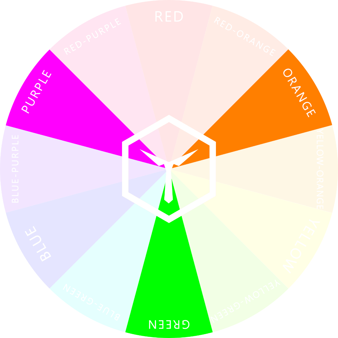
The 3 secondary colors in the RYB color wheel: orange, green, and purple.
If you mix two primary hues “50-50” you get a secondary color/hue. The three possible secondary colors are therefore: orange (red+yellow), green (yellow+blue) and purple (red+blue).
Tertiary Colors

The 6 tertiary colors of the RYB color wheel.
Tertiary colors/hues are the ones you receive when you mix a primary with a secondary hue. Or mathematically speaking: 75% of one primary color and 25% of another primary color.
Tertiary hues are named according to the primary and secondary color that were mixed. For example: “red-purple” or “yellow-orange” - whereas the primary color is always named first. There are a total of six pure tertiary hues.
How to use the RYB-Wheel for Fashion:
In fashion, we use the color wheel to classify clothing colors. Every piece of clothing has some sort of color and is therefore classifiable by hue.
Since there are a total of 12 pure hues in the fashion color wheel any piece of clothing will match (at least) one of those hues. Yes, the match might not be perfect, but you have to categorize it somehow.
It’s important to note, that tinting, shading or desaturating a hue does not change it’s position on the color wheel. Follow the links to learn more.
If you understand the principle of the color wheel, you’ll understand all the rules for color in fashion quickly. Read the article to learn all 10 Golden Rules to learn about how to use analogous, complementary, and seasonal colors (and much more).


![Top 8 Best-Matching Colors [Which Ones & Why]](https://images.squarespace-cdn.com/content/v1/5d91f9da52210569ede7ff3a/1651242239176-CXWJHIC3RXVB7QT9A8IS/COLORBUX+Best+Matching+Colors+Top+8+Pairs+BANNER+Thumbnail.jpg)

Tones in Clothing
TONE = The result of adding gray to any given color.
The concept of tones in clothing is a different one to tones in regular color theory, where a tone is what you get when you add gray to a color.
We at COLORBUX think that the use of “tones” is obsolete. We refer to colors that have added gray as “unsaturated”. In the case of a color becoming less saturated, it also appears to be more grayed out – because it’s luminance stays the same but it’s hues fade.
Should the luminance change, we would call this either shading (darkening) or tinting (lightening). So, for us, creating a tone of a color is simply the process of removing (desaturating) color and maybe changing its value. What? - Don’t fret, the following example illustrates this concept further:

The color magenta: saturated and unsaturated (top/bottom) with all it’s tints and shades (left/right).
In fashion, we call the colors of pieces of clothing that are less bright “unsaturated”. These unsaturated elements (“tones”, if you will) are best used as canvas colors because they simply lay a good foundation to build the rest of the outfit upon.
Tones are usually easy to match and combine with other colors since the hue of the tone isn’t as obvious and doesn’t stand out too much. Wearing unsaturated or grayed out colors is usually best suited for less chromatically inclined people...
The topic of tones is closely related to that of luminance. Click here to learn more.
Neutral Colors in Clothing
NEUTRAL COLOR = Color, that is either “earthy”, inconspicuous, average, or a combination of the three.
Neutral colors are typically the easiest color to use. And we mean "use" in the widest possible sense. Whether in fashion, design, or even real estate, neutral colors are exactly that: neutral.
We define colors as “neutral” if they fall into one of the following categories:
Black
Gray
White
Beige

A color combination that is astonischingly suitable for many occasions. The outfit radiates seriousness and intelligence, yet also playfulness and openness. | Socks: Pine-Able
Neutral colors are best suited to be used as canvases and are therefore most often worn as such. In our example image, the canvas color is navy blue and the accent colors are pink and light pink.
Navy blue counts as a neutral color. It is one of the most common colors on our planet, which makes it very inconspicuous and a good choice to wear. This is one of the reasons why a dark blue suit is almost a must-have in any man’s wardrobe.
Tints in Clothing
TINTS = Colors that have added white to them, making them lighter.
Tints are the opposite of shades. You create a tint when adding white to any given color. By doing so, you increase the value of said color and you make it lighter.
Tinting a color makes it lighter and be perceived as less saturated because the apparent brightness of the color gets reduced. Tints are colors like “pink” (light red) or “mint” (light blue-green) and so on.

From white to fully saturated: all the tints of the color blue-purple.
Light colors in clothing make the person wearing them seem more open, outgoing, and friendly. They are less suited for very formal occasions and are more often used in casual settings.
It’s widely accepted, that tints are more feminine – but it doesn’t have to be that way. Men can benefit tremendously from using tints in their outfits. The signals the wearer sends by highlighting instead of darkening, can, if done correctly, make a huge difference in how he or she is perceived by others.
Using tints in an outfit, makes the wearer stand out in a group. They are most often used as accent colors in clothing but are also sometimes used as canvas colors. The latter is especially true for tints of neutral colors.
More on tints (and shades) and their meanings in clothing in this article >
Shades in Clothing
SHADES = Colors that have black added to them to make them darker.
A color becomes shaded when you add black to it. Adding more and more black darkens the color until it is fully blacked out.
Therefore, darkening a color makes it be perceived as less saturated as well. Why just perceived, you ask? Well, effectively the color is still there. There’s just a lot of black added to it. If you were to take away color, you always get a value of gray (not black). More on grays and saturation here.

From black to saturated blue-purple: The 50+ shades (more like infinite).
Shades of colors typically make clothing seem more elegant and formal. Wearing darker colors makes you stand out less and makes you blend in more. These are the reasons why it’s usually best to wear darker clothing to more serious formal events or business occasions.
Shaded colors are most often used (in fashion) as canvas or base colors. They provide a solid (mostly neutral) foundation to build the rest of the outfit upon.
Shades are rarely used as accent colors because they don’t “pop” out as much as bright or light colors. Neutral and tinted hues are best suited to be accents.
Interestingly though, darker colors are very suited to be sub-accent colors due to them being less conspicuous.
The opposite of shade is called a tint. More on shades and tints and how to use them in this article >
Saturation in Clothing
SATURATION = Intensity of any given color.
Saturation (also chroma) describes the intensity of any given color in clothing.
A fully saturated color has neither black nor white or gray mixed into it, which gives it neither a shade nor a tint. Any fully saturated color is therefore of neutral value and pure hue.
The overall saturation of an outfit is determined by a mixture of the colors of all pieces of clothing together.
Wearing more unsaturated pieces reduces the overall outfit saturation. Wearing more saturated pieces does the opposite – to some extent.
Wearing complimentary colors reduces the overall perceived saturation.
The more analogous or identical the fully saturated pieces of clothing, the more saturated the overall outfit is perceived.
Image 1: Tints and shades of green

Image 2: unsaturated to saturated green
In our first example image, the color green is shown with its spectrum from fully tinted (left, white) to completely shaded (right, black). In the middle is the fully saturated color. This is also a good example of the different values of the color green.
In the second example, the color green goes from full chroma with the same luminance (left) to complete neutral value (right). Since the green hue has very high luminance, the unsaturated version of it (left) is almost white.
Read more about shades, tints, and contrast in our article about dark versus light clothing colors.
Sub-Accent Colors in Clothing
SUB-ACCENT COLOR = Is a color that contributes little to the outfit and does not define it in any way.
Sub-accent colors, or sometimes referred to as “filler colors”, are accent colors, that take up the least color “real estate” and that contribute the least to the overall appearance.
Contrary to accent colors, “subs” do not define the outfit and are usually not ever remembered post-hand. In short: no-one can ever recall a sub-accent color after having looked at an outfit for only a brief moment.
Sub-accents are also sometimes called “fillers” because they fill up the leftover color space. They are usually tints or shades of the canvas color.
Here’s an example:
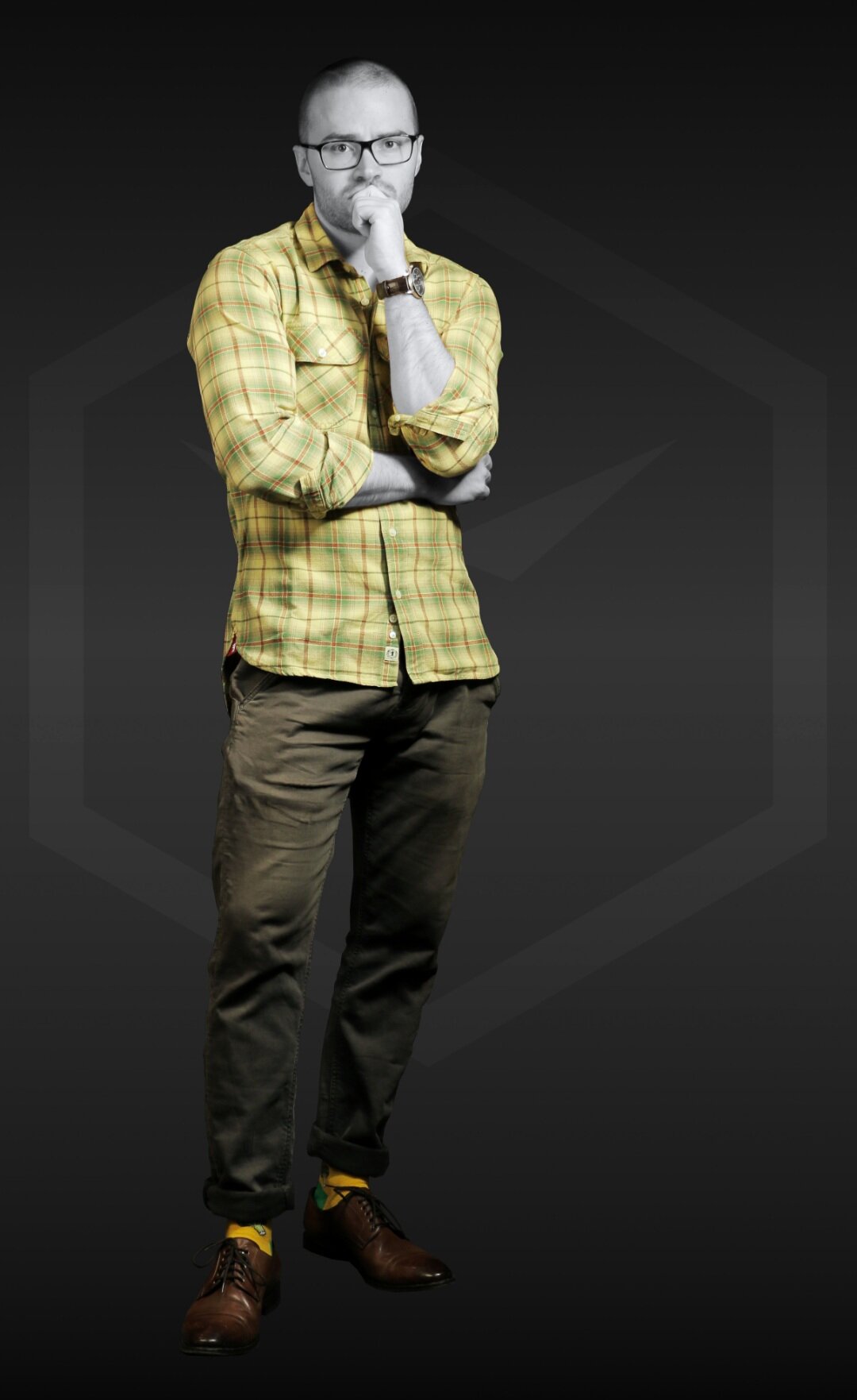
In this outfit the subs are red (from the shirt) and lime (from the heals of the socks and the shirt). The accent colors are yellow, yellow-orange and brown. The canvas color is olive.
Accent Color in Clothing
ACCENT COLOR = Accentuates an outfit with a small amount of color that makes it more interesting.
The accent color is the color that contributes the least to the overall hue of an outfit but still plays a key role in making the outfit as interesting as possible.
An accent color makes up only a few percent of the set of clothing and is usually not visible from afar. From up close, though, it defines the whole outfit by giving it an often much needed touch of personality.
It is called “accent” because it accentuates ones clothing in a way that makes the entire get-up memorable and note-worthy.
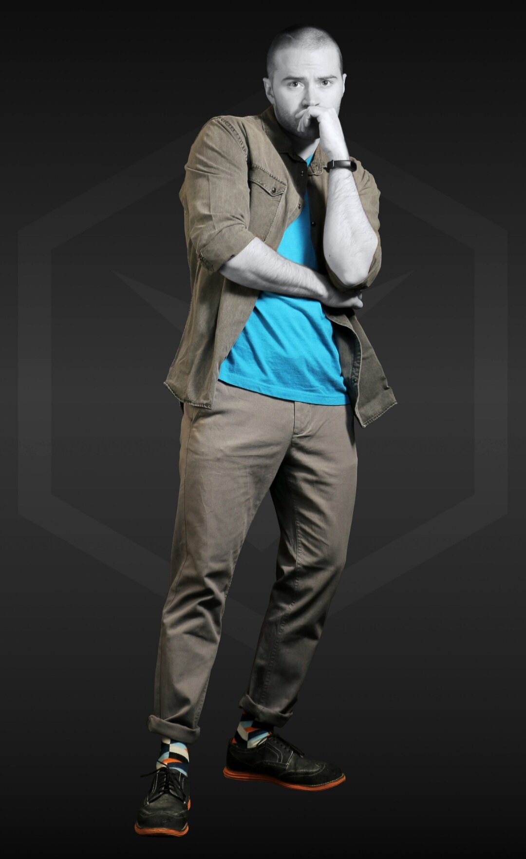
As always, here’s an example:
In this outfit, the two canvas colors are gray (pants) and navy blue (shirt). The accent colors are cyan (analogous to blue) and orange (complementary to blue). Both accent colors are present in the socks. The sub-accent “color” is black (shoes).
Find out how to use accent colors correctly in this article >
Canvas Color in Clothing
CANVAS COLOR = Most prevalent color in an outfit or piece of clothing.
The canvas color is always the most prevalent color of an outfit. It is sometimes also referred to as “base color”, but we prefer the term “canvas” since it paints a better mental picture.
The canvas color is usually not very saturated. More often than not, it’s a neutral color such as dark brown or dark blue.
Most of the time you’ll find the canvas of an outfit to not even be of any color. In such a case, it would be black, white or any gray value in between.
As always, here’s an example:
Socks: Color Crates
In the example image, the canvas “color” is very obviously middle gray. Both the trousers and the denim shirt are gray and, as such, part of the canvas.
“On top” of the canvas, you have the accent colors. In our example, these would be bright blue-green and orange. The sub-accents are dark gray and black.
Note: Every outfit has a canvas and every piece of clothing has a canvas (base) within it’s own color scheme. This is why all of our products (by themselves) are labeled with base, accent and sub(-accent).
Hues in Clothing
HUE = Color, fully saturated without modifiers.
The word “hue” describes the fully saturated “color” of any given color. The value of the color is neutral. This is best explained using examples:
The hue of “red” is red
The hue of “light red” is red
The same goes for “pink”, “burgundy”, and other versions of red
In fashion, when we speak of hues, we refer to the fully saturated color as well. This is why we sometimes call a navy blue shirt “blue”, even though the perceived color is darker than the blue hue.
A more extreme example would be a pair of beige trousers, which would have to be classified as “yellow” or maybe “yellow-orange” in hue.

The toughest hue: Orange… Brown and skin-tone are both of orange hue, but the red-orange (bottom right) is not!
Wearing an outfit consisting of only one hue (with different shades, tones, and tints) is what fashionistas call monochrome style. It looks fabulous but isn’t as easy to pull off as you might think.
We categorize our products into different hues. So, if you’re looking for a pair of “lime” socks, try searching in the category “yellow-green”.
Color Value in Clothing
COLOR VALUE = “Lightness” of the color.
The value of a color determines how light it is, therefore value is sometimes referred to as “lightness” (NOT “brightness”). A higher color value in clothing means the color has more white elements, and a lower value means it has more black.
A fully saturated color (hue) has neither added black nor white, which makes it have a neutral value. If you add white to the fully saturated color, you get a tint. Conversely, if you add black you get a shade.
Interestingly, different fully saturated colors can have completely different luminance (brightness). This is a topic best described by physicists, so we’ll leave it at that. Here’s an example of color value for you:

The same hue (yellow) is shaded (left) and tinted (right). Reducing their saturation reveals the shade and tint.
In the example image, dark yellow (on the left) becomes gray when unsaturated, whereas light yellow becomes almost white with a bit of a gray touch to it. The effect the hue “yellow” has on the observer is completely different depending on the value it has.
You can use this knowledge to your advantage when putting together an outfit. How exactly?
We write more about light and dark colors in clothing in this article >